

I have been making stuff on the web for thousands of years, and that is a cast-iron fact.
TL;DR: I have a metric truckload of links to free-to-use fonts that you might like to be somewhat aware of very much actually.
Font Hard
Back in the dark ages of website building, you had literally[1] eight typefaces[2] to choose from that would work across all[3] OSes[4] and all[5] browsers[6]: five sans-serif, two serif, and a monospaced. Why so few? Browsers of the day couldn’t embed font files in the pages you were viewing, and had to look on your computer for the font you had used, and only this select bunch could reliably be semi-guaranteed to be on everyone’s computer. To get around this, generations of designers resorted to putting all their headline and decorative text in images, or even more arcane methods (anyone remember sIFR? *shudder*) to achieve their desired results.
Font Hard 2: Font Harder
Several[7] decades later, CSS and browser advancement brought us embedded fonts ubiquitously supported across the known galaxy, thrusting us bodily into a golden age of web typography. Now you can use literally any typeface you can imagine (and many that you can’t) on literally any web page, literally just by thinking about it! Literally[8]! You can spaff a hundred different fonts onto every page you make!
But should you?
Font Hard With a Vengeance
Of course you shouldn’t, for several mind-buggeringly good reasons. Of these, the first two that leap to mind are:
- It will look shit
- Fonts are someone’s copyrighted work, and if you use them without a license that’s software piracy (or “stealing”[9], if you prefer)
And it is this second reason that brings me back to my beloved soapbox today, ladies and gentlemen and Evil Dave. I recently posted about how I was given to remove all traces of the work of Eric Gill from my web presence, and in doing so I went on quite the typographical safari while researching alternatives. I found some absolutely top-drawer fonts that are free for commercial and non-commercial use and/or licensed openly for anyone to use as they see fit, and because I am a kind and benevolent future galactic emperor, I will share these with you now.
NB: I could have embedded each of these fonts live into the page, or I could have inserted an image sample of each one. I chose to do neither of those things to reduce the number of files embedded in this one page. Instead there is an image sample for each that you may click to view, should you desire. You’re welcome.
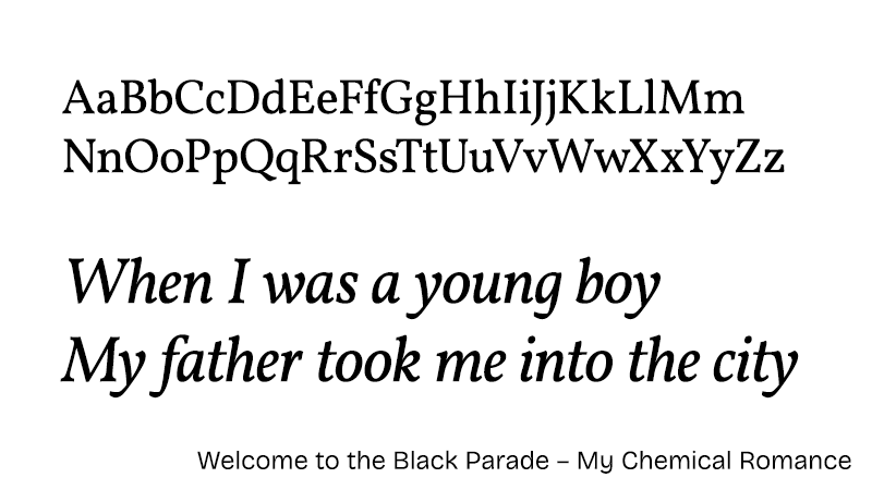
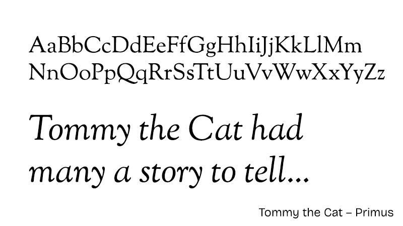
Que Serif, Serif
If you wanted serifs on the web, it was either good old Times New Roman or Georgia. I spent years using Georgia because TNR was the boring-ass default that a browser would use if you didn’t specify a font at all – still is[10]. This was where I would casually bung in Perpetua and impress the amassed adoring crowds with my typological nous, until I discovered what a bastard Gill was.
However, after literally[11] years of research, I can now bring to your attention:
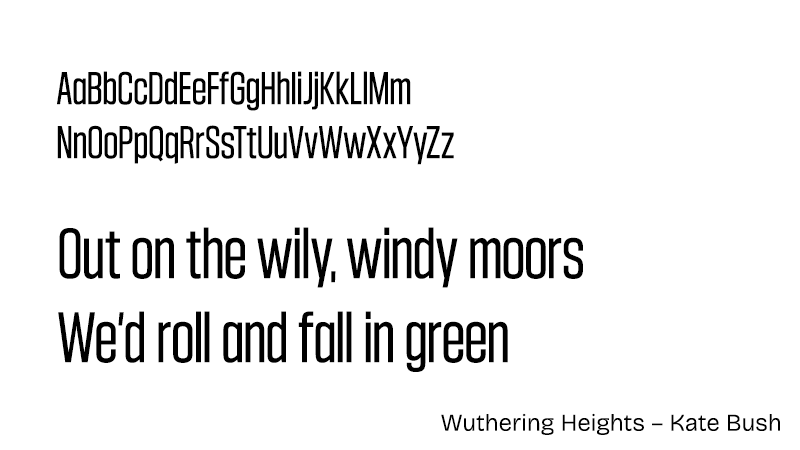
- Vollkorn by Friedrich Althausen – sample
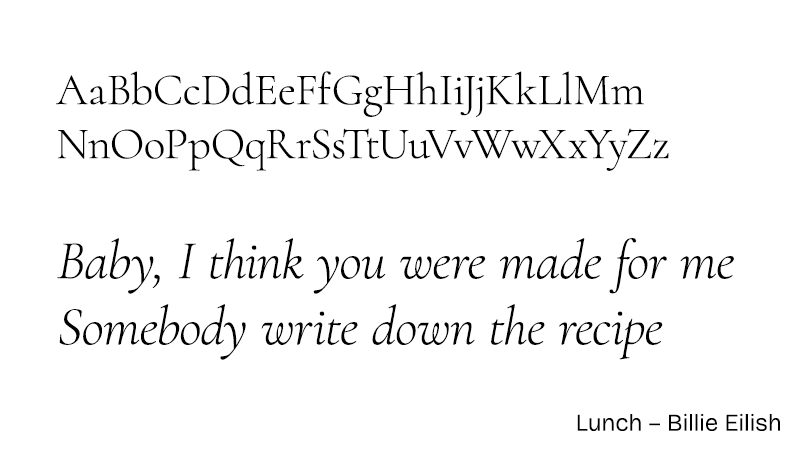
This is an absolutely excellent serif font, let down only slightly by the absence of weights below 400. - Cormorant by Christian Thalmann - sample
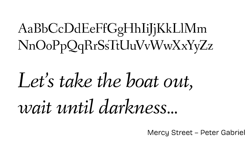
A gorgeous serif in a nice range of weights and variants. An ideal replacement for Perpetua, great for body copy. - Fanwood by Barry Schwartz – sample
One of three great serifs from Barry Schwartz of The League of Moveable Type. - Linden Hill by Barry Schwartz – sample
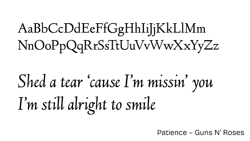
One of three great serifs from Barry Schwartz of The League of Moveable Type. - Sorts Mill Goudy by Barry Schwartz – sample
One of three great serifs from Barry Schwartz of The League of Moveable Type. Lovely stuff. - IM Fell DW Pica by Igino Marini - sample
Perhaps not ideal for blocks of body copy, but this one has buckets of character. Read a bit about the Fell Types if that sort of thing interests you.
The Sans of Time
Pre-renaissance, we had five – FIVE! – sans-serifs to choose from (including Comic Sans and Impact, that is), and a good portion of my formative years were spent laying everything out in teeny tiny 10px Verdana. However, I am happy to say I have since made a full recovery, and now I quiver to bring you these lovely alternatives:
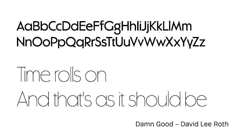
- Klima by Matthew Hinders-Anderson - sample
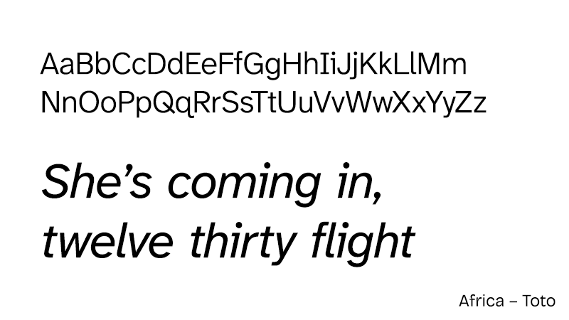
Intended initially as “a softer, more relaxed version of DIN”, this grotesque is primo gear and comes in seven weights with italics. Delete that unlicensed hooky version of DIN and get Klima on the go. - Barlow by Jeremy Tribby - sample
Three widths, nine weights, all with italics, in all the formats you can eat plus a variable TTF for later, all for free, and all looking fabulous. You can see why it’s in the top 20 most used fonts on the web. - Union Gothic by Matthew Hinders-Anderson - sample
A really nice variable width display font that goes from extremely condensed to ultra wide, in variable weights from 400 to 1000. Versatile. - Caviar Dreams by Lauren Thompson - sample
A lovely free geometric typeface to help wean you off your Futura addiction, perhaps. Nice. - Greve by Matthew Hinders-Anderson - sample
Another variable display face from Matthew Hinders-Anderson with a lot going on on the width and weight axes. - Mort by Matthew Hinders-Anderson - sample
Another geometric this time with variable weight from 100 to 1000. Looks really great at maximum chonk, but all the weights pop.
Sans Macabre
These ones are technically sans-serifs, but they’re a bit different. Come along would you, and let’s have a little look at them just now very much in fact.
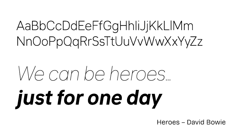
- Atkinson Hyperlegible Next by The Braille Institute - sample
There have been a few typefaces released over recent years that claim to be super easy to read, but this one is backed and created by The Braille Institute of America who know a thing or two about making things legible. I use it for most of my body copy. You’re probably reading it right now. - Inclusive Sans by Olivia King - sample
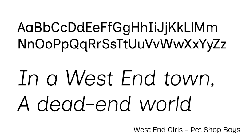
Another super legible typeface backed by research into legibility, Inclusive Sans additionally aims to tackle readability issues faced by those with neurodiverse conditions. Great work. - Lisnoti by Tim Gordon - sample
Tim Gordon is not a type designer or a typography expert but a frustrated user, as he explains in his excellent blog post on the genesis of Lisnoti. It is a proportional font designed for coding, a practice almost exclusively carried out in monospaced (fixed-width) type. Having wanted and searched for such a thing for 15 years, Tim finally “decided to stop waiting and to make one myself”. I have been using it to code for a week or two now. I’m not 100% sure if I dig it or not yet, but it’s definitely interesting. - Bricolage Grotesque by Mathieu Triay - sample
This neo-grotesque from a French designer living in England attempts to marry the two worlds in “a typeface with French attitude & British mannerisms.” I reckon he’s nailed it. Variable width and weight axes too, which is very nice. - Sans Forgetica by the Royal Melbourne Institute of Technology - sample
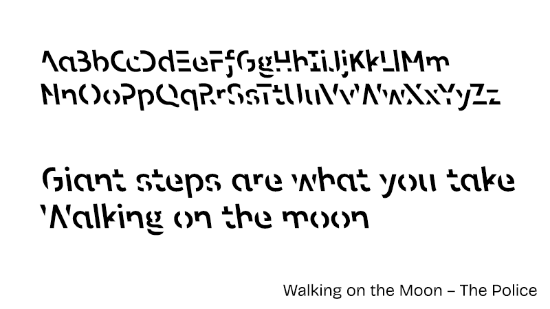
I love the idea behind this one. It’s almost the opposite of Atkinson Hyperlegible or Inclusive Sans – it is intentionally harder to read than regular text. What the eff? Well, quite. There is science involved, but the basic idea is you print out study notes (or a speech, or lyrics, or anything that you want to remember) in this font, and then when you read those words back your brain will “engage in deeper processing” than if you had simply read them in a clearer font like Futura or Times, and this leads to better recall. Your mileage may vary, but it’s a nice idea.
NB: this font is licensed to RMIT under the CCBYNC license (creative commons, non-commercial, attributed), so don’t just go slapping it into public or commercial work without attribution.
Breaking the News
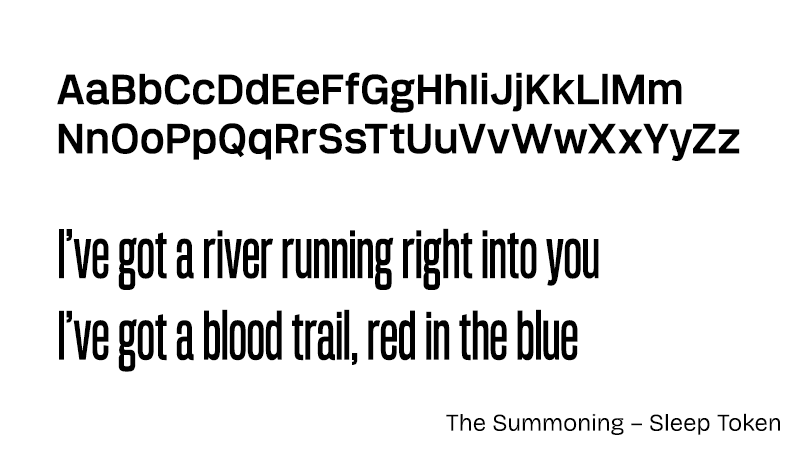
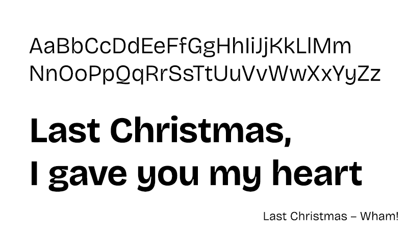
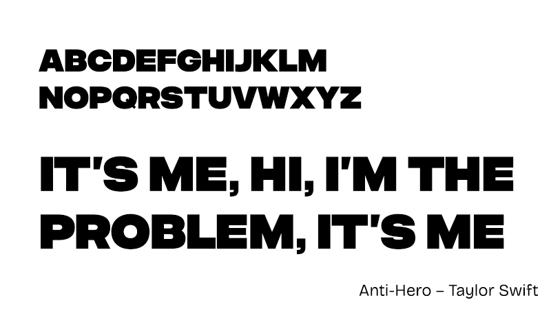
You could possibly get away with using Arial Black for your headlines back in the day, but it wasn’t usually to be found on Macs. It was safer to just go with Arial or Helvetica bold, or Impact if you didn’t mind condensed. Nowadays with variable fonts like Union Gothic you can just whack up the weight and the width, and hey presto, Robert is very familiar with your mother all of a sudden. But if you want a dedicated chonksome headliner, why not try this absolute unit:
In awe at the size of this lad.
I’ll Fix YOUR Width in a Minute
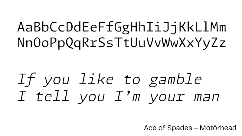
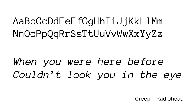
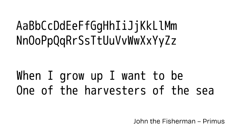
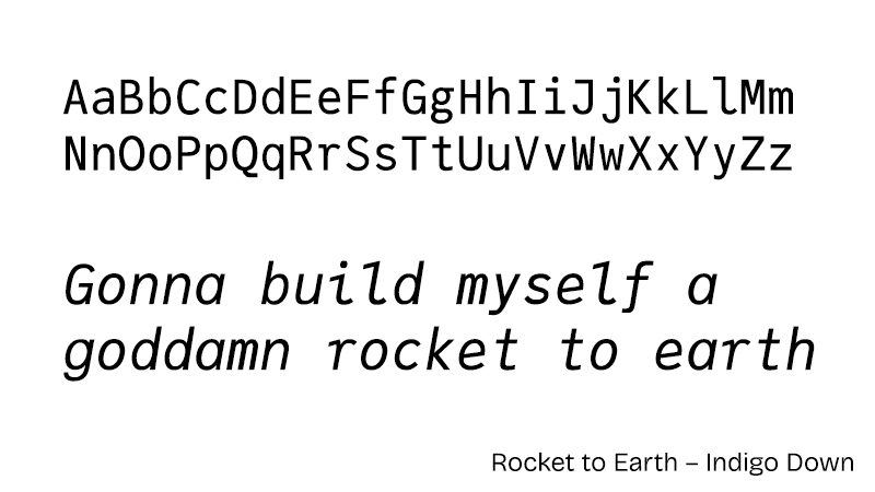
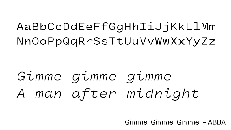
I’m a web developer by trade and I spend most of my day in code editors and terminals, usually in a fixed width font. If you wanted to use one on the web back when I started out your choices were Courier[12]… that was it. We’ve come a long way since then, and here are some choice alternatives I’ve picked up over the years that will spruce up your code samples and SSH windows:
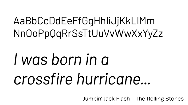
- Monaspace superfamily by Github Next - sample
The Argon variant of Monaspace has been my terminal font for two or three years now and all five faces share the same set of excellent features. The “texture healing” feature is a great way to get around one of the issues that usually affect monospaced fonts, and I think really improves overall readability. Very nice stuff. - Anonymous Pro by Mark Simonson - sample
This was my terminal and coding font for a good five—could be ten actually—years before switching to Monaspace. It ticks all the coding font boxes (no ambiguous characters, legible at small sizes, very clear at larger sizes, supports a wide character set, pleasant to read) and is genuinely a joy to stare at all day. - M+ 1m by Coji Morishita - sample
I still have a zip file of mplus fonts that I downloaded well over a decade ago containing M+1m and lots of other variants. The lowercase m denotes monospace. I can’t seem to track down these exact faces on the web now, but there is an updated version from the same author which appears to include “M Plus 1 Code” which looks similar. This is really good at small sizes, but works fine when you bump it up too. - Julia Mono by Cormullion - sample
Julia Mono is a code font that features “a wide range of specialist and technical Unicode characters”, and they really are not kidding. Each TTF file is ~3.2MB and contains over 12,000 glyphs, where Monaspace Argon (for example) has 785 glyphs. If you want to cover all the bases, or your online technical documentation uses an unholy range of special characters, then Julia Mono has you covered. (If not, think about whether you want to make your users download ~13MB of font files…) - Clack by Matthew Hinders-Anderson - sample
Matthew’s fonts are on time, every time, and his monospace is no exception.
Flip the script
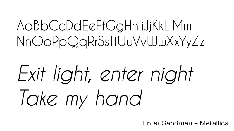
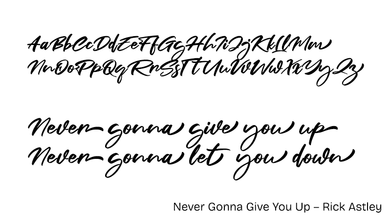
I’ve left Brush Script off my initial list intentionally, because there are some things that in this modern age really should not be. If you really must use cursive on the web, you should probably have a bit of a think about why that is. That said, I am quite partial to:
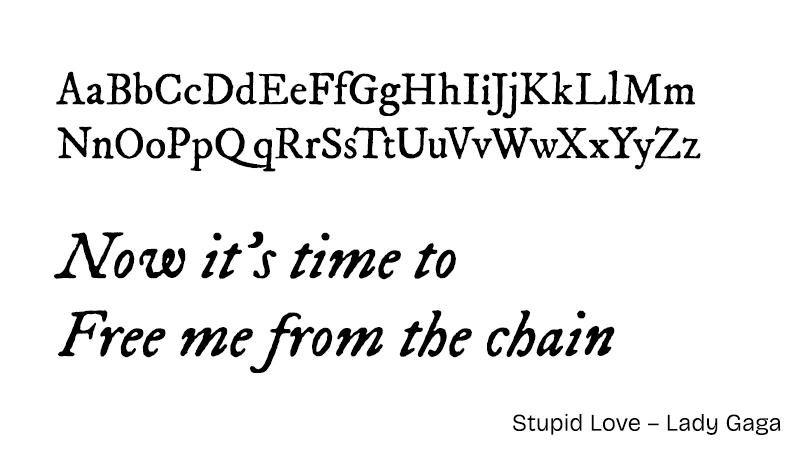
- Fair Prosper by Khurasan - sample
…but in the name of all the saints and sinners, go easy would you? A little script goes a very long way.
Type Free or Font Hard
Let’s just remember why we’re here, n’est-ce pas? Fonts/typefaces are copyright[13], and you need a license to use them. Someone put a lot of work into DIN, and Proxima Nova, and Kora, and Wensley, just like I put a lot of work into writing and making music. It’s easy to forget that you are using a piece of software that someone else toiled over when you’re slapping a title onto a flyer in Photoshop or cooking up a dank meme[14] in… whatever the kids use, and scrolling through 1000s of typefaces looking for the one that will pop.
Monotype—one of the big boys in the digital typeface playground—have an explainer about it, and this quote sums up what I’m getting at here:
“Fonts are made by the human hand, painstakingly drawn over months or sometimes years, and engineered to perform perfectly. This is what you’re paying for when you license a font: Not just the letters on the screen, but the time and care the designer put into it, often the result of a lifelong dedication to the craft.”
Sometimes these things are damned expensive, too. A full set of Helvetica Now[15] licenses will set you back ~£550. This kind of thing is taken care of for you if you work at a design agency (or at least it damned well should be), but for the average Joe with a laptop in a coffee shop mooching on the free wifi, it might be a little prohibitive.
So, there are two paths you can go by[16]. You can take the easy route and just use whatever you like, download the trial version of whatever it is and never buy a license, just get on with it, because who’s really going to care? Or even notice? Probably no-one, it’s true. It is software piracy, but unless your website suddenly goes viral or your band suddenly gets signed to a mega-deal or whatever, the thing you’re using your pirated fonts for is extremely likely to go utterly unnoticed and no-one will care one jot. Not one whit. Not a dickybird. The tree will fall in the forest and no-one will hear. Sure. Great. Well done.
Or, you can… not do that.
And this is the way I am going now. As I’ve covered earlier in this Ted Talk, there are free open source alternatives that look awesome for just about anything, if you just take a little time to look for them. Or perhaps cheap fonts are worth your time? Some of the fonts I mentioned earlier are around $20 for a commercial license. If the thing you’re doing is making you money, maybe buy a license for the font, and help the designer to be able to make their next one.
And, you know. You can feel good about it too.
A Good Day to Font Hard
This won’t apply to everyone. If you’re an actual graphic designer, then your standards will likely be higher than mine and these cheap/free alternatives might not quite cut it. But then, if it’s your profession, you should pay for the tools you use.
But if you’re an amateur knocking stuff up at home for whatever reason, you can find good typefaces on the web for free that meet your needs. You don’t have to just use whatever is on your computer, and you don’t always have to load up Google Fonts[17] and spend an afternoon scrolling through endless lists (lists that contain Lobster and Papyrus, for shit’s sake).
Nobody needs Lobster or Papyrus.
–c.
P.S. Sorry, what was that? You have a question? Why all the Die Hard references? Well, it’s like this, see. When I was trying to come up with a title for this, I typed “Font Harder” and it just spiralled from there. Plus it’s Christmas. Ho. Ho. Ho.
P.P.S. Those original eight fonts[18], in case you were wondering:
- Arial – sans-serif
- Verdana – sans-serif
- Trebuchet – sans-serif
- Impact – sans-serif
- Comic Sans – sans-serif
- Times New Roman – serif
- Georgia – serif
- Courier New – monospace
Further Reading
- Intellectual property protection of typefaces (Wikipedia)
- Why do I need a font license? (Monotype)
- Some of the best free fonts (Clearleft)
- System Fonts (Practical Typography, by Matthew Butterick)
- The League of Moveable Type’s manifesto
- Bricolage Grotesque demo site – this is how you demonstrate a font on the web – bravo, Mathieu!
Literally ↩︎
“Fonts” and “typefaces” are subtly different things – a typeface is a font family, which can contain several fonts. Now you know. ↩︎
Both ↩︎
Windows and Mac (but no-one had a Mac) ↩︎
Both ↩︎
IE and Netscape (but no-one used Netscape) ↩︎
Two ↩︎
Not literally ↩︎
I think it’s fairly well known now that the infamous “You Wouldn’t Steal a Car” anti-piracy ads on TV in the mid-2000s did in fact themselves use a pirated font, which is moderately hilarious ↩︎
Well technically it’s “Times” not “Times New Roman”, but that’s really splitting hairs at this stage ↩︎
No ↩︎
Again, no-one cares about the difference between Courier and Courier New, not even me… just let it go ↩︎
Of course it isn’t quite that simple. They can’t actually be copyrighted in the USA, though they can in other more sensible countries. But copying them isn’t the same as using them, and you still need a license to use them. ↩︎
Did I do that right? ↩︎
But in the long run, there’s still time to change the road you’re on ↩︎
The Spotify of the typography world ↩︎
Sourced via my own memory and Core fonts for the web on Wikipedia. I discounted Andalé Mono because it was not installed on Macs of the time. I discounted Arial Black because it was basically Arial, and was not on older Macs. I discounted Webdings because it’s Webdings. ↩︎

Speak Your Brains
Comments system: Meh from Splitbrain