
I am going to try not to make this another 3000+ word rant, I swear, but there has to be some preamble. If you just want the main takeaway, however…
TL;DR: Eric Gill was a bastard and I will not use his typefaces any more.
Several thousand years ago[1] I worked in a print shop in Eastbourne, which is where I am from. It was my first half-decent job, and I spent my days laying out people’s business cards and letterheads. I had no qualifications in that area, and was just lucky that they needed someone who knew their way around Corel Draw and Adobe Pagemaker. It led on to my first web job in Brighton, and from there the rest is history.
Anyway, the manager of the shop was a printer and typesetter called Ben from whom I learned loads, and also from whom I picked up an adoration of the typeface “Perpetua” to go alongside my fascination with “Gill Sans”[2].
Anyway, life continued, and even up to a couple of months ago I was still breaking out Perpetua for headings on websites and YouTube thumbnails, because it looks great. One day something made me read the Wikipedia entry on the creator of these typefaces, Eric Gill. If you are of a sensitive disposition you may not want to go and read that yourself – I shall just tell you that he apparently got up to some pretty abhorrent things[3].
I never liked Lostprophets in the first place, so when the atrocities of Ian Watkins came to light, my music collection was safe. When the awfulness perpetrated by the likes of Rolf Harris and Jimmy Savile (and so many others) bubbled continuously to the surface during the 2010s, I shook my head and was appalled of course, but it wasn’t like I had to go home and throw away my huge collection of “Jim’ll Fix It” DVDs or anything. I never really listened to that much Michael Jackson, so deleting a couple of albums hardly stang at all.
But I couldn’t go on shoving Perpetua into everything without feeling a very considerable ick, so it had to go.
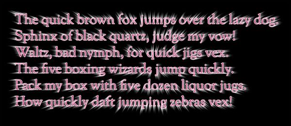
I redid my YouTube thumbnails using Sorts Mill Goudy a little while ago, and this week I have been through my whole web presence making sure I only use fonts that are open source or free to use, and have no connection with the bastard Gill.
There’ll be a more in-depth post coming up on this soon, but in the meantime why not check out:
- Fonts for a progressive future, by Matthew Hinders-Anderson
- Atkinson Hyperlegible, by The Braille Institute
- Bricolage Grotesque, by Mathieu Triay
- Monaspace, by GitHub
The late 1990s. ↩︎
In my second actual web job, in London in 1999, I worked with a designer by the name of Ed. In the first week we discovered that a) we shared the same birthday, and b) we shared the same favourite typeface, Gill Sans. His favourite character in Gill Sans was the uppercase “Q”, and mine was the lowercase “t”. So there you go. ↩︎
The whole trifecta, I’m afraid: paedophilia, incest, and bestiality. Jesus. ↩︎

Speak Your Brains
Comments system: Meh from Splitbrain